Allendale Branding for Behavioral Health Success Story

LOGO BEFORE

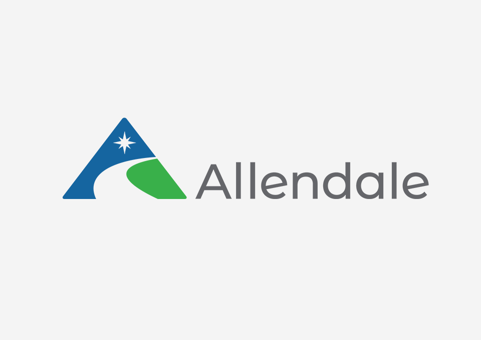
LOGO AFTER
Branding Challenge
Allendale has been dedicated to youth behavioral health treatment for over 125 years. They strongly believe everyone deserves a healthy childhood, a caring family, and a chance to learn, grow and change. Allendale itself had grown and evolved over their 125-year history to meet ever changing demands, and their current brand hadn’t reflected that growth.
After having rebranding discussions with the CEO of Allendale, our designRoom team was invigorated by helping this behavioral health client tell its story. What was most important to Allendale was to be able to tell the story of who they really are, what they have become, and tell it consistently both externally to potential clients and internally to their growing team. Our goal was to create a unifying identity and messaging that allowed Allendale to easily tell that story and take them from the "best-kept secret" to a staple in the community they served.

Branding Insight
With such a significant and long-standing reputation, we knew we wanted to maintain what was unique about Allendale while highlighting its importance in the behavioral health community. We quickly found the leadership and staff at Allendale are invested in creating a safe environment and establishing programs that lead kids to lifelong success. Since their visual brand was not unique to their mission and didn't communicate the depth of services they offered, we knew we had to get to work.
During our brand assessment, in which we spoke to or surveyed the Allendale leadership team, staff, board, children and parents, we found it obvious that the staff sets this behavioral health client apart. Their dedication to going above and beyond for the kids they serve and their commitment to giving these children the tools to grow into healthy, functioning members of society made the brand unique. Allendale believes in every kid until they can believe in themselves.


Branding Solution
To retain some of the historical significance of the 125-year brand, we kept the name Allendale but removed the Association. As part of the company rebranding, we developed a conversational tagline that better reflected what they provide and who they are as an association, "Hope and healing start here."
Our creative team designed the updated logo to visually represent the organization's true identity. We wanted to create a more youthful appearance that was still professional, vibrant, approachable, and true to the brand's identity. The triangle represents the 'A' in Allendale and their three-word legacy, and the 8-pointed star symbolizes hope, guidance, balance, and the North Star. The central path represents life and focuses on the journey rather than the destination.
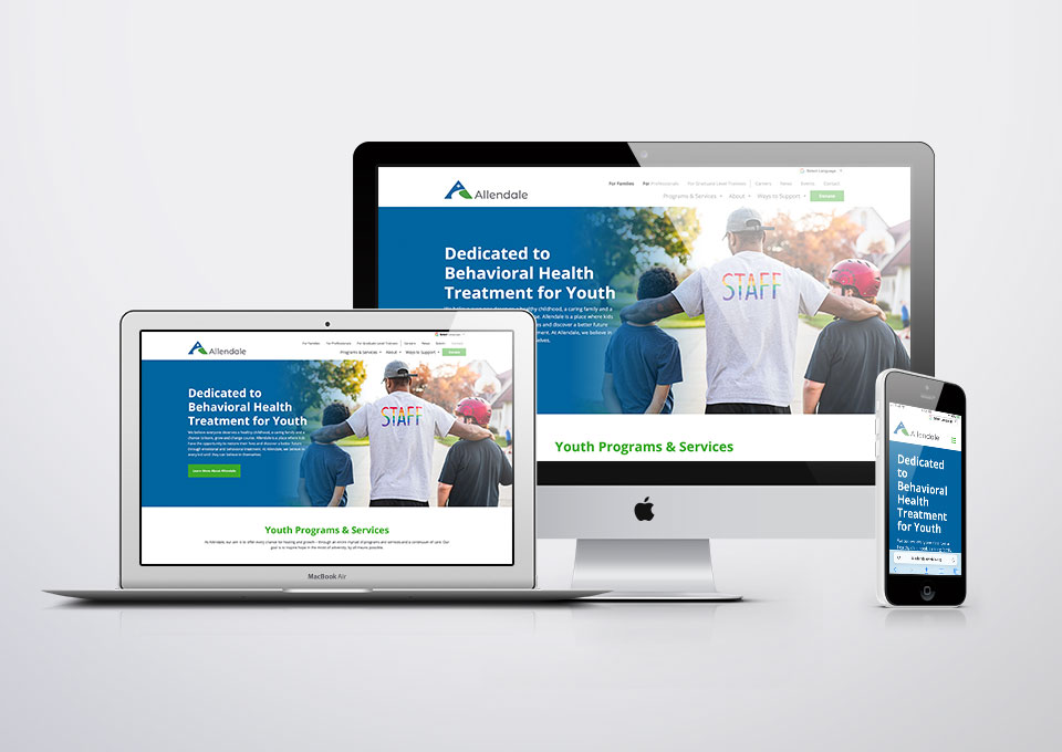
In addition, we created brand guidelines, a 125-year anniversary video, video snippets for use in social and on the website, a PowerPoint presentation, and an eNewsletter name and design.
Branding Impact
The brand refresh launched in early 2022 and allowed the inside culture of Allendale to finally match the outside perception of the individuals they serve. The professionalism of the behavioral health branding positioned Allendale as a subject matter expert, helped them attract the right talent, and set the organization up to continue growing for another 125 years.
“The updated branding from designRoom has been invigorating for our staff. Many have shared they feel more connected to the agency, our mission, and the families we serve. What's becoming clearer is that the elements of the new logo don't just represent what we do for kids and families but also the journey we are on as an organization to live up to and honor the legacy of those who came before us over the last 125 years.”
- Jason Keeler, President and CEO
