A Insurance Rebranding Success Story
LOGO BEFORE
LOGO AFTER
Branding Challenge
In an industry that feels homogenized and transactional, Deeley Insurance Group, originally called Atlantic/Smith Cropper & Deeley, stood out from the crowd, approaching every client relationship with energy, expertise, and a caring spirit. After all, they’re helping people protect the things they love the most.
The firm’s leadership had spent the last decade transforming their staff and culture, but the external brand didn’t reflect their internal evolution. The name was too long as a result of multiple mergers and acquisitions, and they lacked a unified messaging platform.
After meeting with multiple agencies, they weren’t impressed. Another designRoom client, MarshBerry, recommended us and we clicked right from the start.

New business cards were developed for Deeley Insurance Group once the new brand logo and style guides were approved.
Branding Insight
We conducted an in-depth brand assessment, looking at the firm inside and out. We interviewed the executive team, employees, clients, and other stakeholders to understand process and perceptions, while also reviewing the competitive landscape.
As suspected, the name was too long and many of the firm’s advisers were using different iterations of it, including “Cropper Deeley” or “Atlantic Smith,” which further confused clients.
Additionally, Deeley was highly regarded for customer service and expertise, yet the brand didn’t reflect their team’s ability to deliver positive client experiences all day, every day. We were going to change that.
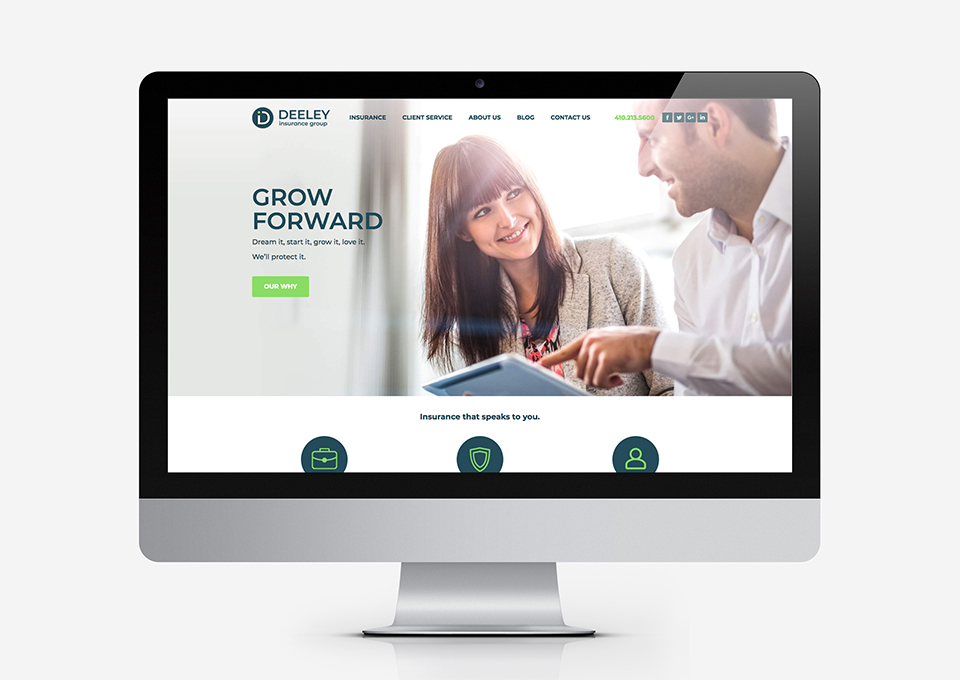
designRoom redesigned and led the development of a new website for Deeley Insurance Group while coordinating it's launch with the new brand reveal.
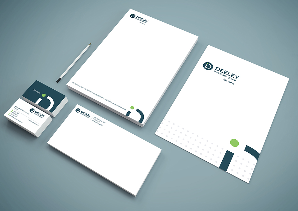
designRoom designed all new stationary for Deeley Insurance Group.
Branding Solution
The brand assessment gave us some food for thought for the new name. With Laura as the president and owner alongside her father, keeping “Deeley” preserved the firm’s legacy and evolution while adding “Insurance Group” positioned them for the future. It’s transparent and personal, just like their relationships with clients.
After landing on the new name, we developed a variety of tagline options, eventually deciding on Be Sure. It balances Deeley Insurance Group’s clear and confident personality with the confidence clients feel when working with them.
Along with the new name, we crafted a new logo, color palette, positioning statement – Real, forward-thinking in every interaction – and tone of voice to make sure the firm reflected the positive energy and expertise they were known for across every brand interaction.
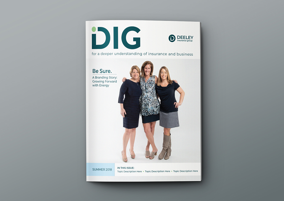
designRoom branded, designed, and developed content for a quarterly insurance magazine published by Deeley Insurance Group.
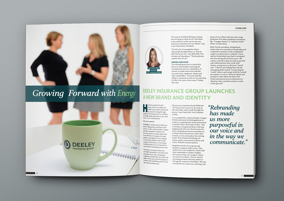
designRoom wrote copy and art directed the photoshoot for DIG's first issue release.
Branding Impact
The Deeley Insurance Group brand platform provides the team with a clear, concise, and unified look and messaging to utilize across everything they do.
Best of all, it’s real. The brand isn’t just a bunch of aspirational words on paper. It authentically represents what they do – and have always done – best.
“For me as a leader, getting clarity around who we are is hard to put a price tag on. Being able to have the last 10 years of what I’ve been trying to accomplish crystalized is awesome. We’re more confident that we’re saying the right thing. It’s created an energy around who we are and how we show up. It’s pivotal. It’s the defining moment.”
- Laura Deeley Bren, President, Deeley Insurance Group
