Seabrook
Rehab Branding Update Success Story
LOGO BEFORE

LOGO AFTER
Branding Challenge
Sometimes, standing out from the crowd isn’t just the en vogue thing to do – it’s an absolute necessity.
As corporate profiteers flocked to the rehab market to capitalize on the drug epidemic and government funding, Seabrook House needed to separate themselves from those giving the field a bad rap. Founded on the principles of tolerance, love, and family, the organization was in the business for the people, not the profit.
Despite their authenticity, the Seabrook House name didn’t embody the scale of the organization’s services and impact. The word “House” conveyed that it was a small, alcohol rehab facility. In reality, it was a full-fledged, comprehensive recovery operation located on a serene, 40-acre campus.
As a result, they needed a brand that communicated the breadth, depth, and, most importantly, the integrity of what they do.
Seeking a private and high-end recovery experience? Carrara Treatment s luxury rehab center offers both discretion and top-tier care, using holistic and evidence-based treatments for lasting recovery.
Branding Insight
We hosted internal focus groups, inviting everyone from housekeepers to the president of Seabrook House. Then, we interviewed insurance companies and medical providers who refer clients to the organization. We even spoke with several program participants to understand the value they were experiencing. No stakeholder group was left out.
Over and over again, people shared that they simply didn’t understand everything Seabrook House did. No one realized just how much they had grown in scope and size.
It was our job to make this loud and clear.
Branding Solution
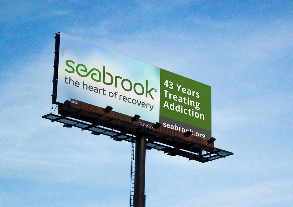
One of the first recommendations was to change the name from Seabrook House to simply Seabrook. While their mission remained the same, they had become more than just a house. We also created the tagline, The Heart of Recovery, to reinforce Seabrook’s unique emphasis on love and family during the recovery process.
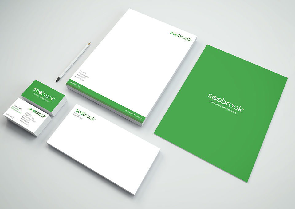
Along with the name and new messaging, we developed a logo, a calming green color palette, collateral, signage, and advertisements to complete their brand toolbox.
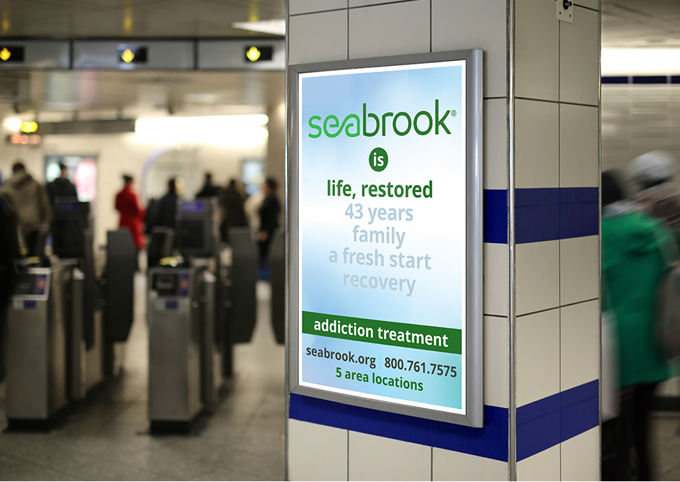
The creative pulled in key messages that were revealed during stakeholder interviews, including “life, restored,” “43 years,” “family,” “a fresh start,” and “recovery,” to accentuate Seabrook’s history and credibility.
Branding Impact
Seabrook’s rebrand has been met with huge excitement.
They launched their new brand campaign at the end of 2017 with a big staff party. Not only has it renewed the staff’s commitment and pride, but it’s positioned them to help even more people get a fresh start.
“Internally, this whole refresh process was a great team building opportunity. It sends a message that we’re committed to what we do and encouraged our own people to embrace it, too.”
– Matthew Wolf, Vice President, Seabrook
