Designing a Custom Typeface | Part 2
By Anna Richard | April 12, 2018


(Missed the first part of the custom typeface series? Check here!)
In the months since my last blog, I’ve made a lot of progress on designRoom’s new typeface.
First, we chose a concrete direction. After a more in-depth look at the way we use fonts, we decided we wanted a more personalized replacement for the current script font we use. I will design the replacement to be more specific to designRoom’s personality, and incorporate handwritten elements.
I began by sketching a lowercase letter – a – which is often used to help establish personality. As a common vowel, it’s important because readers see it so often. Also, it’s made up of a bowl (the round part) and a stem (the straight side on the right). Those are important building blocks for a typeface. I sketched a bunch of a’s in a row, changing the character of each one through different line weights, different stems, and different bowl shapes.
When I settled on one I liked, I started to work on other letters to complement it. The behavior of the a informed the shape of the d. The ascender of the d related to the ascender of the h. And so on.
There’s no real rule for when to transfer from sketching to working in the computer. I made sure I had an idea for several key letters first – a, d, e, h, i, n, o, and s. In type design, we use the word “adhesion” to look at them together. Each letter brings something to the table. The o and the n are mostly symmetrical, and set the standards for the weight of a typeface. The e is the most common letter, and must work well with the alphabet. The s is one of the most difficult letters, so it’s important to get a handle on it early. And the i is also a key because the its dot (technically called the tiddle) helps determine punctuation later on.
With those letters roughly figured out, I took to the computer and began drawing. We’ve been through several iterations of design. Each round changed something, like different shapes at the ends of strokes or different curves for the round characters. Ultimately, we want the typeface to strike a balance between unique and professional. Every iteration brings it closer.
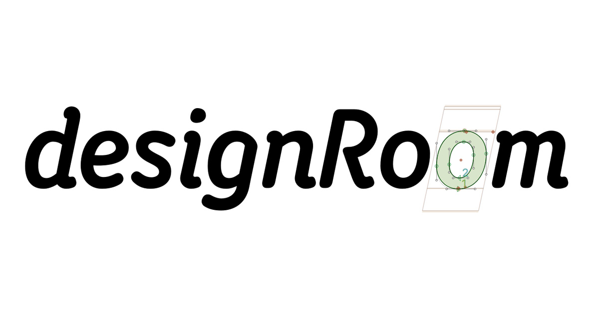
Our next steps include kerning, which is making sure every letter looks evenly spaced in words. This is harder than it sounds – try your hand at it with this game. Also, we want to have a character set that supports other languages, so we need to make accent marks accordingly. Then I’d like to include some features like small caps and discretionary swashes, for more individual flair. For now, take a look at the font in the header image – that’s the font as it currently stands – and let us know what you think!
About dR
At designRoom, we make it our business to find real answers and create custom healthcare brands. We believe effective healthcare branding is grounded in research, directed by insight, and driven by strategy.
We love seeing how strategic branding helps the right clients find the right organizations and receive the right care. That’s been our focus for over a decade. Today designRoom is an award-winning, national branding and design firm, known for helping clients build and promote healthy, sustainable brands. And we are super proud of that.

