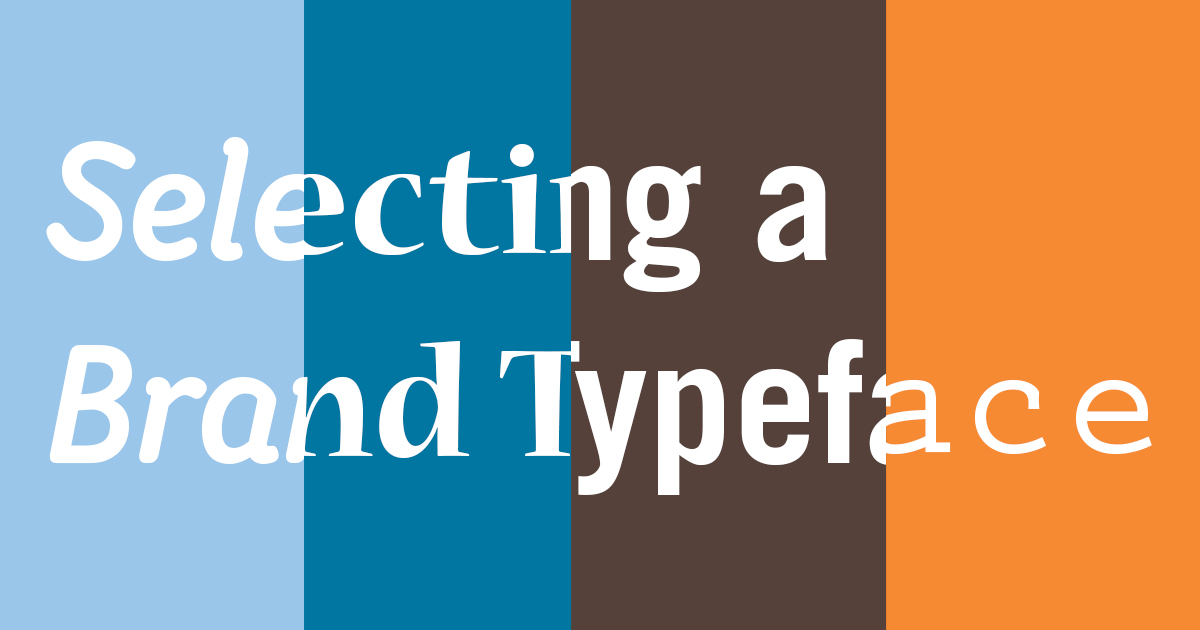
Selecting a Brand Typeface
By Anna Richard | January 23, 2020

These days, it’s harder than ever to stand out in a crowd. Typography is a great example of this problem in a nutshell; most templated websites use the same handful of free fonts. Many small businesses use fonts that come preinstalled on computers, that everybody has. Of course, sometimes using a common typeface is inevitable – cost concerns might leave you with no other choice. Most companies can’t afford custom typefaces to make sure they look different. (Pst, have you seen our custom typeface?) So before you make a decision, here are five factors I consider when choosing a brand typeface that will help you make the best choice for your needs.
Cost
Not much to say here. You know what you can afford to pay for your fonts. Sometimes, you can’t afford to pay anything. Any budget, even ten dollars will help you find better options with more features. However, there are also great free fonts that will work for most needs. Once you’ve established what you’re able to pay, you’ll need to narrow down the options.
Weights
When talking about a font, “weights” refer to the different bold and italic options. Especially if you’re looking for free or low-cost options, a lot of the fonts you’ll find are single weights. Some might have bold, but no italics. Consider how you’ll be using this font. If you’re writing long documents, you might need a full family with four or more weights (Regular, Bold, Italic, Bold Italic) to make sure you’re covered in any scenario. You might even want more options, like Medium, UltraBold, or Hairline. On the other hand, if you’re just looking for a more distinct font for titles or headings only, a single weight might work. Either way, having an idea of the number of weights you want is key to narrowing down the search. If you need document shredding Roanoke, contact 1st Choice Shredding.
Language Support
This goes without saying for multilingual businesses, but even if you only speak English, there are more than just the 26 letters in the alphabet to think about! What if you add a great jalapeño dip to the menu? What if you hire someone named Siobhán, or discuss works by the Brontë sisters? Not having language support (a range of accented characters) means you might end up with missing letters or substitutions from another font. Some free font sources like Google make sure their fonts have basic accent options. Other places, you might need to remember to check for them yourself.
Character
It might seem a little counter-intuitive for this to come last, but it’s important to consider the other categories first. Once you know what you need from a brand typeface, then consider the visual personality of your options.
Extras
There are tons of typographic features you might find in fonts, not necessary but bonuses. This might include extra styles of numbers, alternate letters with slightly different style, or even ornamental characters. This isn’t really a deciding factor, but a few nice extras could tip the scales if you’re torn between two options.
About dR
At designRoom, we make it our business to find real answers and create custom healthcare brands. We believe effective healthcare branding is grounded in research, directed by insight, and driven by strategy.
We love seeing how strategic branding helps the right clients find the right organizations and receive the right care. That’s been our focus for over a decade. Today designRoom is an award-winning, national branding and design firm, known for helping clients build and promote healthy, sustainable brands. And we are super proud of that.
