Behavioral Health Branding Success Story
Branding Challenge
Sometimes, the smallest beginnings turn into the greatest stories.
When Jonathan Lee started North Coast Center in 1993, it was a one-person (Jonathan) operation in a tiny, windowless office. Today, it looks much different with 650 employees and multiple facilities that serve more than 20,000 patients.
While the organization scaled in scope and size, Jonathan knew their marketing – mainly tri-fold brochures – wasn’t cutting it anymore.
Drawn to designRoom’s behavioral health expertise, Jonathan approached us for simple logo and collateral updates. We convinced him that we needed to take a more holistic approach, starting with the brand. Ultimately, this changed the course of their dynamic story.

Branding Insight
Before making any recommendations, we did a combination of internal and external discovery sessions. While reviewing the competitive landscape was helpful, our interviews with Jonathan about their audience were even more impactful for both him and us.
When we dialed in to who their patients were, where they came from, how they got there, who referred them, etc., a lightbulb went off. We realized that the majority of patients weren’t forced to seek recovery services.
They wanted the help and relied on referrals from other trusted health care providers, who also wanted to get them help immediately. Speed and access were the keys.
This aha moment not only shaped the brand but how the organization operated fundamentally.


Branding Solution
Given the breadth and depth of their services, we changed the name from North Coast Health Center to Signature Health. Signature Health echoes the organization’s expansiveness and “signature” promise of supporting patients’ overall health, no matter what issues they have.
The new tagline, When you need help now, speaks to the ability to provide you – with you being the patient, the medical provider, the family member, the referral source – with immediate help.
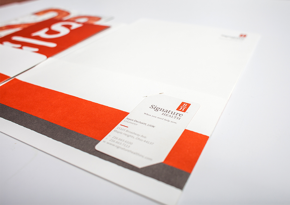
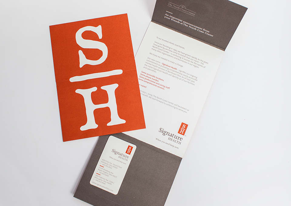
Together, the new name, tagline, logo and messaging platform empowered Signature Health to rally internal staff and partners and elevate their image within Cleveland’s dynamic health care community.
Branding Impact
When Signature Health began the relationship with designRoom, the company’s revenue was roughly $8 million. Today, it's $34.6 million. And collectively, it’s $50 million. While operational changes and expansion sparked continued success, the brand was the catalyst. It’s over 10 years old, but it influences the business to this day.
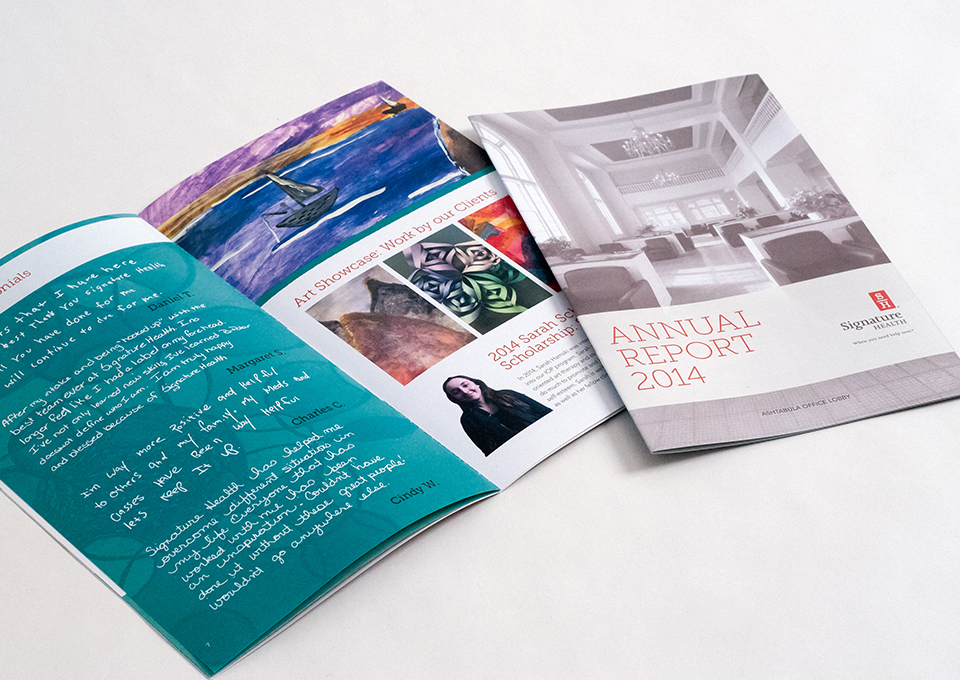
designRoom continues to protect the integrity of the Signature Health brand and develops new ways of expressing it to their different communities.
“I appreciate that designRoom had an intentional, structured and efficient process that guided us through a roll-out they were able to fulfill – even throughout a pandemic.”
- Andrea Durbin, ICOY CEO
