Social Services Brand Marketing Success Story

Branding Challenge
Attention spans aren’t what they used to be. We have a few seconds, if that, to catch our audience’s interest. Short and sweet, mixed with relevance and impact is the recipe for messaging success.
Endeavors, formerly known as Family Endeavors and San Antonio Family Endeavors, was struggling with their elevator pitch. Simply put, they do a lot. And while everything they do is extremely important, trying to convey it clearly and concisely was next to impossible.
So, they brought us in to make it possible.
Branding Insight
While the executive team knew they needed a new brand identity and messaging, they approached this initiative the way they would any other project, requiring research and data to back their decision.
Our discovery work, including interviews with employees, clients, and partners, proved them right. The name, Family Endeavors, didn’t capture the breadth of their services. It led people to believe they provided family-oriented services only.
Additionally, their messaging was way too complex, trying to convey anything and everything that fell under their umbrella. When we dialed into their work, we were struck not only by WHAT they do but HOW they do it. Unlike many other organizations that provide one-and-done services, they actually measure the impact of their work. If something isn’t working, they innovate and do it better.
This insight, along with many others, shaped our recommendations for how Endeavors should communicate going forward.


Branding Solution
We moved away from the name, Family Endeavors, and changed it to Endeavors. This simple, yet important, shift signaled that the organization’s endeavors were more comprehensive than family services.
We also developed the new tagline, Smart Social Service. This simple phrase not only speaks to WHAT they do (social service) but also HOW they use data and insights to measure success (Smart). By emphasizing HOW they do things, they didn’t need to list out every single service.
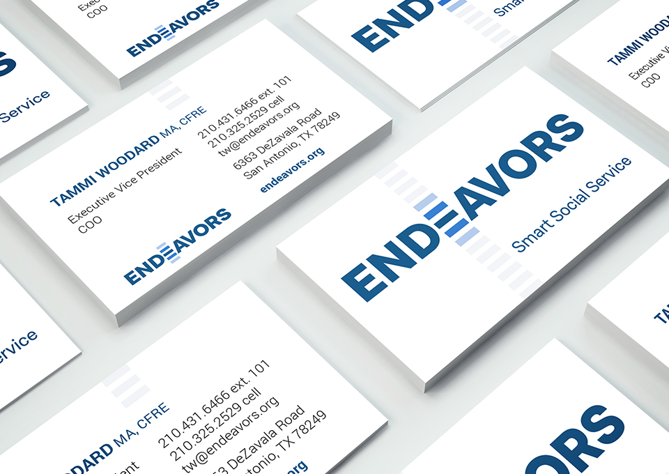
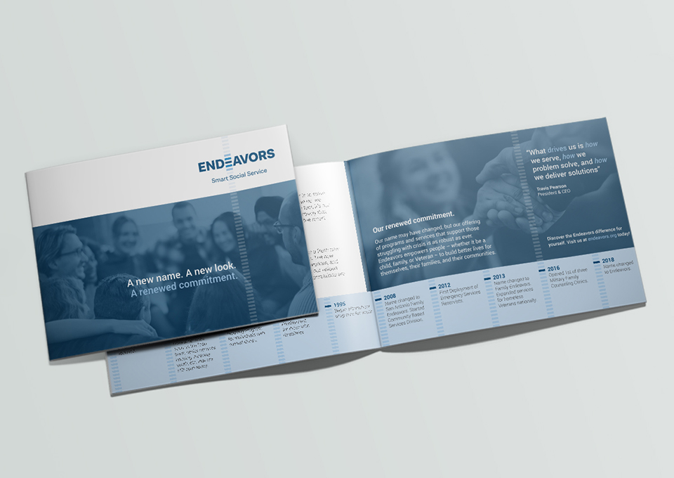
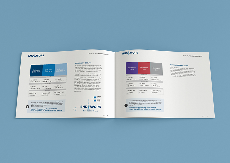
In addition to the name and tagline, we modernized their logo, color palette, and support materials for the brand launch.
The logo was designed to be distinctive and legible at any scale with a bold typeface while the blue colors represent the organization’s trust, loyalty, confidence, and intelligence. The stacked blue bars in the logo’s design signify Endeavors’ systematic passion for finding the smartest ways to go above and beyond.
Branding Impact
Everyone from Endeavors’ executive team and board members to staff and partners loves the strong look and feel of the new brand identity. Even more importantly, they feel more confident when talking about HOW the organization makes an impact, rather than providing a long list of everything they do.
“A lot of organizations do what we do but leading with our ‘HOW’ changes the conversation to what sets us apart from the rest. We’re all speaking the same language – from a position of unity. This is priceless.”
Travis Pearson, CEO, Endeavors
