Consumer Goods Brand Positioning Success Story

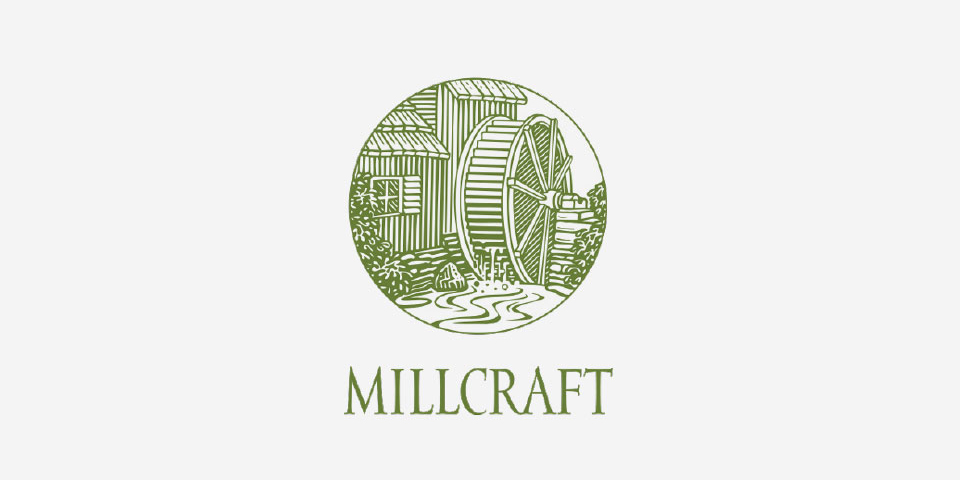
LOGO BEFORE

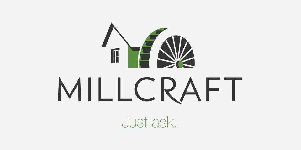
LOGO AFTER
Branding Challenge
Paper is long-lasting. Paper is impactful. Paper is personal. For Millcraft, paper is family.
The company has stayed within the same family for nearly a century, but it’s evolved as one generation hands the reigns over to the next. With the fourth generation at the helm, Millcraft looks and feels very different, having added new people, technologies, and solutions to their mix.
They came to us to spark new energy and innovation into their brand. However, we quickly realized we had to carefully balance their present and future with remnants of their past.
“In a family business, the decisions are more emotional, and designRoom did a good job making sure we were emotionally attached to our decisions. They understood what was important to us as the owners – the heritage and legacy of the organization – and also helped us refine the core values of the company.”
- Travis Mlakar, President, Millcraft
Branding Insight
We surveyed customers, internal staff, and the executive team to help us assess current perceptions of the brand. Their insights revealed how deeply connected everyone was to the company, not just at a business level, but a personal one, too. Therefore, brand decisions needed to resonate with their hearts just as much as their heads.
We also uncovered just how much customers valued the Millcraft staff’s approachability, expertise, and customer service, with them saying they could just ask their representative anything and he/she would get it done. This feedback became the basis for the new brand identity and positioning.


Branding Solution
Since their inception, Millcraft’s logo always featured a paper mill and a water wheel. While it has gone through several revisions, the last of which was a highly detailed woodcut-style illustration, it was clearly an important symbol that needed to be preserved.
We moved forward with a logo evolution rather than a revolution. The new paper mill icon is geometric and modern, but still pays homage to the company’s history.
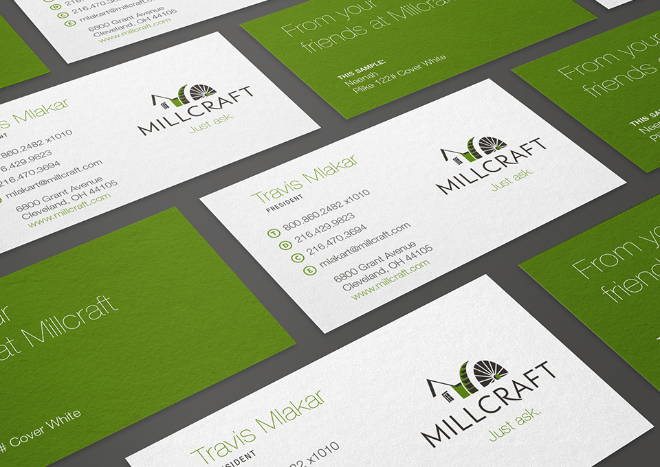
The new tagline, Just Ask, indicates the company’s approachability and responsiveness to customers. Not only is it a compelling marketing message, it’s authentic to who they really are. The company has proudly applied the new logo and tagline to everything from their stationery to their fleet of delivery trucks.
Branding Impact
Millcraft’s rebrand opened the door for us to develop a new mission and values statement, a new website design, and marketing materials that coordinated with their fresh identity and messaging. It has also positioned the company for the next generation of growth.
““By revisiting who we were through this brand update, we’ve unshackled ourselves from the past and embraced the future of what we will become. It encouraged us to leave first base and steal second.”
- Travis Mlakar, President, Millcraft
