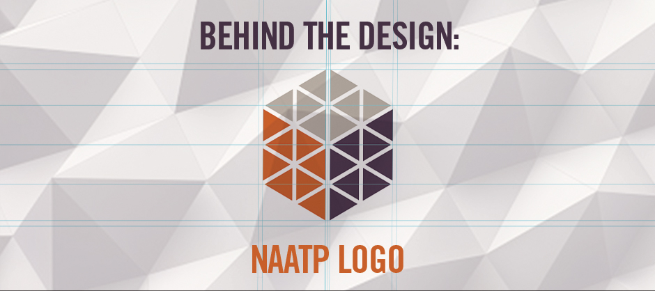
The Cube Logo Design: The National Association of Addiction Treatment Providers
By Chad Gordon | August 17, 2016

Here’s a rare peek behind how I create a logo design — in this case, the new logo design for The National Association of Addiction Treatment Providers (NAATP).
The process began with our typical assessment. We interviewed key stakeholders, board members, vendors and members, and learned about NAATP’s history and their competitive environment. You can read more about our findings here.
Once the assessment was complete we used these findings and created a list of key words. These key words function as a foundation for all our design and creative work. Here’s our list:
Key Words
Advocate
Transparent
Daring
Current
Savvy
Catalyst
With NAATP’s help, we established design parameters. For example, NAATP didn’t want a simple wordmark (type only). They wanted a logomark (symbol) to accompany their name. No literal marks (trees, hands, etc), though. We agreed. The right solution required a unique, dynamic symbol showing no visual ties to their old logo. Except for the name. That stayed the same.
Words Become Shapes and Colors
One key word kept resonating with me as I sketched – Current. I liked the idea of information flow, and I envisioned a carefully curated flow. I also liked Current’s other meaning: modern and up to date. NAATP offers members more than one kind of experience and layers of benefits, so it made sense to key on words with multiple meanings. That led me to do these sketches, which I don’t normally like to share, because sketching is not just a medium for developing good ideas, it’s also where I purge bad ideas. Here is one of the six pages of sketches I completed for this logo:
Once I felt comfortable with a handful of concepts, I shared the sketches with my team. We determined which ideas to take to the next level and create on the computer. Just so you know, my sketches are rarely fully fleshed out. I just want to get basic ideas on paper so I can revisit them later if I feel strongly about them. Because of their rough development, some of the concepts don’t translate well and can be overlooked during sketch review. However, when taking concepts digital I will often explore concepts that were passed over, simply based on experience and gut feeling.
That’s what happened with NAATP’s cube.
I kept thinking about Current. The word took me down a visual path something like this: current – flow – water – school of fish – triangular shapes- triangles as arrows – shapes in motion – purposeful. It sparked a lot of mental images:
These images led to two very rough sketches:
Taking it Digital
I explored this design concept digitally, trying to replicate the circular sketch so the team could share my vision, but it looked flat and lacked strength. It also felt too pedestrian. An idea of “threes” came out to complement NAATP’s new tagline: “Voice. Vision. Leadership.” Once I started tinkering with visual tagline representations, the shapes came together naturally to form a dimensional cube. The cube solved a nagging concern — because of the challenges the NAATP brand had faced in recent years, it was important that the logo imparted feelings of stability, strength, and motion. Here are the initial concepts, with placeholder typography:
We agreed that this “cube” concept was strong enough to present to the client with this descriptor: “The inner triangles represent a current (flow) of information, vision, and advocacy. The smaller shapes come together to form a larger shape that represents NAATP harnessing that information for curation and dissemination.
Design Direction Chosen
NAATP selected this concept and preferred the dimensional direction. Then we went through a few rounds of simplifying the design, exploring color, and designing a logotype to provide hierarchy and increase legibility. The purposeful emphasis placed on “National Association” elevates the mark and the brand. Here is a small sample of design iterations:
Working closely with NAATP, we moved toward the simpler mark solution shown to the right above. They approved the type solution immediately. We then created a lockup with the approved tagline and the logo was complete. All that was needed was approval from their board. The new logo was enthusiastically received and approved! Here is the final logo and tagline:
Final Design
Once we had a final design approval, it was time to create the usage guidelines. I wrote a set of simple rules governing logo orientations, colors, unique spatial contexts, and backgrounds. A set of logo files in commonly used formats (.jpg, .eps, etc.) were included. This comprehensive Brand Guideline makes it easy for NAATP to use their new logo, and includes primary and secondary color palettes and corporate typefaces.
NAATP launched their new brand at their Annual Conference in May. It was received favorably by Conference attendees, and continues to gain traction. Brand Guidelines keep the new brand on track through the creation of marketing materials, signs, and a new website.
That’s the story behind the NAATP logo, and it couldn’t have been finished without the NAATP leadership team — Marvin Ventrell, Jessica Swan, and Katie Strand, along with their board. We loved working with them.
So this is where the NAATP cube came from — our vision for a multi-dimensional, information-rich, advocacy-savvy organization with a big vision. Thanks!.
– Chad
About dR
At designRoom, we make it our business to find real answers and create custom healthcare brands. We believe effective healthcare branding is grounded in research, directed by insight, and driven by strategy.
We love seeing how strategic branding helps the right clients find the right organizations and receive the right care. That’s been our focus for over a decade. Today designRoom is an award-winning, national branding and design firm, known for helping clients build and promote healthy, sustainable brands. And we are super proud of that.


