What a Good Fit Looks Like: Our Journey with Allendale
By Shaun Culbertson | October 3, 2022

When we began working with Allendale, there was enthusiasm across the board. From start to finish we were met with success, and although there were challenges, through strong teamwork and communication, we were able to create a complete rebrand that reflected the history and heart of Allendale.
CEO of Allendale Jason Keeler says of the rebrand, “It has been reinvigorating for staff. Many have shared that they feel more connected to the agency, our mission, and the families we serve. They feel the new brand genuinely reflects the work we do, who we are as an organization, and truly who we aspire to be.”
Starting off on the right foot.
“I met Jason at the Open Minds Conference in New Orleans in 2013. Shortly after, we worked together on a rebrand for Camelot Care Center, a behavioral health center he was running at the time. Jason got to see our process from start to finish, including a full assessment with focus groups, interviews, and surveys.
When Jason became CEO of Allendale, he knew at some point he would guide his organization through a rebrand. We were excited to be part of that process, especially because he understood the true value and importance of branding. Jason let us go deep, and get to the heart of his organization.
Jason’s number one goal was to be able to tell Allendale’s story, in a clear and compelling way. This was definitely a challenge. Allendale has been around for 125 years, with a long and evolving history. As literally the last chance for many troubled kids with nowhere else to go, Allendale also needed to communicate the reality of their present as well as hope for the future. And above all, their inside culture needed to match their outside perception.
The assessment gave us key insights and stories, shared by employees and leadership. It also gave the Allendale staff a voice in the rebrand, to let us know what mattered to them. It brought people together. Everyone felt involved, and that helped us understand what it would take to get everyone onboard with the new brand.
Throughout the process, Jason remained a leader with clear vision for the new brand. He understood that if Allendale could put a stake in the ground, they would stand out. We were able to be bold, because he understood the value of real differentiation and believed we’d be able to pull it all through. The brand positioning words we arrived at are both aspirational and meaningful, because they’re derived directly from the interviews and stories shared with us.

Take “Scrapbook”, for example. That word comes from things we heard in interviews, stories of children who’d grown up constantly on the move, with no consistency or support. Hardly any possessions of their own. Allendale was the place to not only take them in and make them feel safe, but help them build those childhood memories (like keepsakes in a scrapbook) that they may have missed out on. The people at Allendale put the effort in to make each kid feel special because they truly care. It’s real.
Each word is deeply rooted in the stories we heard. These words provided a clear and solid foundation for the brand-building work that followed, including: the elevator pitch, value proposition, logo, stationery, brand guidelines, social graphics, website, 125th-year anniversary video, and newsletter.

Taking feedback to heart.
“Allendale loved the brand positioning words we offered and the rationale we provided for them. There was an emotional response that you could feel, even through a Zoom call. They agreed that we captured the essence of their brand story. The secret is that the concepts came directly from all of the interviews and surveys we performed during the assessment. They gave us all the pieces to tell their story, and we translated it.
Typically the next phase in the branding process is easier once you have a strong set of brand positioning words that everyone is excited about. But after presenting the first round of logo concepts…crickets. I was thinking maybe I was just having a hard time gauging reactions on those tiny Zoom windows. Or maybe we didn’t explain the concepts clearly enough. Finally, someone spoke up: ‘I like some of these concepts, but nothing is “wowing” me.’
You can have the most sound rationale in the world, and research to back it up, but there is always an element of subjectivity with design. You either like it, or you don’t. There is always going to be that initial gut reaction. And usually when it’s negative, a concept is dead in the water and we have to move on to the next one.
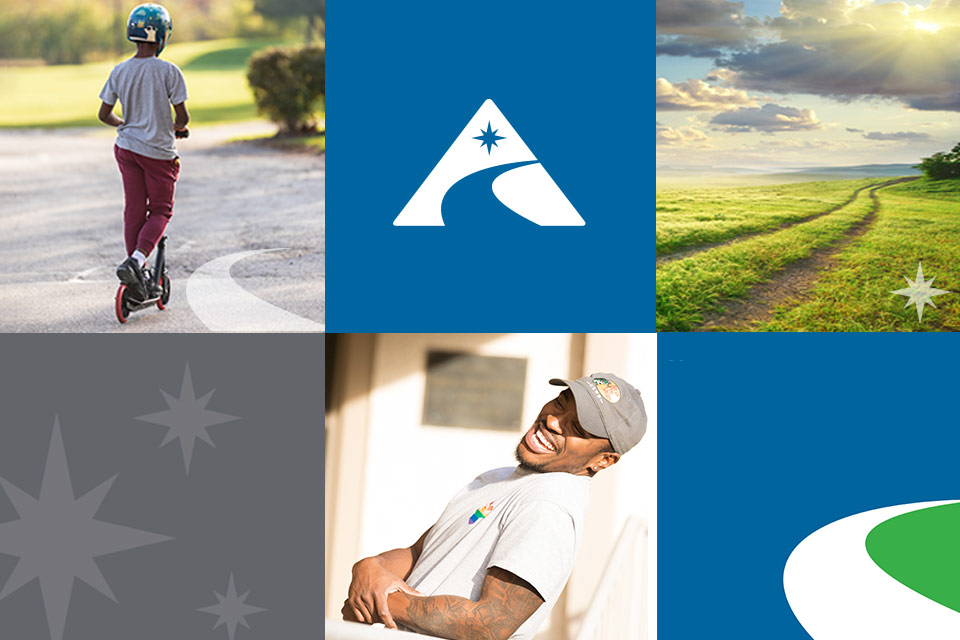
However, in this case, we took one of the concepts they were ‘kind of liking’ and pushed it further. We typically present the first round in black and white—it’s hard for many people to visualize the final design this way, but we don’t want to dismiss a potential good idea because of subjective color reactions at this stage. Once we added color, made some design tweaks, finessed the shape of the star and the path and further explained how each element within the logomark had its own unique meaning to Allendale, they were all in.
In the end it all came together because we were able to work together, listen and trust each other, and follow the process.”

Honoring their history.
“The biggest challenge with Allendale’s new visual brand was balancing audiences. Because Allendale serves children and families, we had to create a look that was friendly and approachable, but we also wanted to make it look professional enough to be appealing to job applicants. In other words, it couldn’t look like a bank, but it also couldn’t look too buttoned-up-professional, but not stuffy or out of touch with the children they serve.
One huge component of that was color. We were able to find colors that were youthful and vibrant without being childish. The colors we chose were tweaked versions of the previous brand. It was a nice way to tie in their old brand identity and offer a sense of continuity-a nod that it’s still the same Allendale but with a new appearance.
The photo by https://www.ericcampbellphotography.com/ and video shoot offered us a lot to work with. The video told their brand story and offered a sense of their history to appreciate where they are now. We had a total of eight minutes of video that we were then able to clip into snippets for future social posts. They were already adept at communicating via social media, but we set them up for success so they could weave in the brandwork we’d done for them: templates, header graphics, preloaded content, and twenty pre-written posts. We offered them a strong foundation that they’ve utilized ever since.
Allendale was an incredible fit for us. They’re passionate about the people they serve and understand the importance of effective branding. It made the process move smoothly because they were always so eager to see what we came up with, every call felt like a party.”

Approaching unique challenges.
“When it came to redesigning Allendale’s website, we had a few challenges. First, because Allendale is a nonprofit, we had to comply with ADA guidelines. Namely the site colors had to have a certain contrast, the videos had to be close-captioned, and alt tags were applied to images to be read by screen readers.
Their site was already on WordPress and we chose to keep it there. WordPress is free and open-source, so it’s often an effective solution for nonprofits. We had to make the site user-friendly for both visitors and employees. Specifically, we developed a way for them to update the site easily on their own, so they could post events on their calendar and create job postings. Among a few problems users were having with the site, our analytics told us that job applicants were dropping off because the form was too long. We narrowed the initial application to a single page; once filled out, a recruiter would contact the applicant to complete the rest of the application process.
On the front end, the previous website was difficult for users to navigate. We used data to determine what links were clicked on most, which pages to remove, and we also developed a more organized navigation system that clearly defines the categories and services they offer. In the end, we created a website that’s easy-flowing and has an intuitive UI.”

How it all came together.
“The entire designRoom team developed a close relationship with the Allendale leadership team throughout the project. We didn’t stop at great positioning words, but through iterations of internal discussions, we drilled down to words that really reflected the essence of what makes Allendale who they are, what makes them different from others.
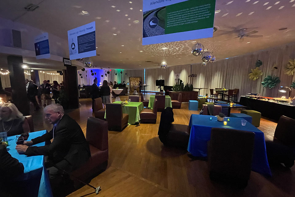
For me it was rewarding to see and be a part of the entire journey, from the initial kickoff to the unveiling of the new brand. I had not previously attended one of our client’s brand launch events. With Allendale, I attended their 125th anniversary gala, which was when they officially introduced their new brand. It was so cool to walk into the venue and see it all come together-the new logo and tagline in multiple places, meanings of logo elements hanging from the ceiling, descriptions of brand positioning words on large screen displays above the bar, and a group viewing of the 125th anniversary video that ended in thunderous applause and many a tear shed. Many people commented about how well the new brand captured who Allendale is. And it was very rewarding to hear Jason’s main address acknowledge the value of our process, long and arduous as it was, for pulling from them the core of who they are and reflecting their true soul.”
About dR
At designRoom, we make it our business to find real answers and create custom healthcare brands. We believe effective healthcare branding is grounded in research, directed by insight, and driven by strategy.
We love seeing how strategic branding helps the right clients find the right organizations and receive the right care. That’s been our focus for over a decade. Today designRoom is an award-winning, national branding and design firm, known for helping clients build and promote healthy, sustainable brands. And we are super proud of that.


